To learn how to look at a painting and actually see it, you need one habit: describe before you interpret. Give a canvas five to ten uninterrupted minutes, write down plain things you notice, and only then ask what any of it means. Most visitors give a painting a handful of seconds, which is exactly why a famous work can leave you standing there feeling oddly flat.
The short version: look before you read the label, note your first impression while it is still unfiltered, find where your eye landed first and trace how it moves, then work through light and color, shape and space, surface and brushwork, and finish by asking what the whole thing adds up to. That is the method below, in the order that works.
None of it needs a background in art history. Every term gets explained the first time it appears, and there is no single correct reading waiting to be decoded. If you have stood in front of a canvas in a small gallery or a church and walked away thinking you were the problem, this is aimed squarely at you.
Table of Contents›
- What You Need
- How to Look at a Painting Step by Step
- How to look at a painting when you first see it
- How to look at a painting by finding its visual path
- How to look at a painting using light, color, and brushwork
- How to look at a painting for mood, story, and meaning
- How to look at a painting in a museum or gallery
- The Seven Elements of Art, in Plain English
- Common Mistakes
- Frequently Asked Questions
- What should I look at first in a painting?
- Do I need to know about the artist to understand a painting?
- How can I tell what a painting is about without guessing?
- Why do I feel nothing when I look at abstract art?
- Should I use the museum label while looking at the artwork?
- How long should you look at a painting in a museum?
- Start With One Detail
What You Need
Almost nothing, which is the nice part. The tools people assume are required are not.
- Five minutes, ideally ten. Under two minutes you pick up composition and nothing else. The smaller details arrive late.
- Something to write on. A pocket notebook, the notes app on your phone, or a pencil on the back of a gallery ticket. Writing forces a second look, which is where most of the value sits.
- A few different distances. Start an arm’s length away, then move back. Most paintings change completely across the room.
- Optional: the wall label and an audio guide. Useful, but later. Reading them first puts someone else’s words in your mouth.
- No prior knowledge. Genuinely none. The artist, the date and the political situation are welcome third-act material, not entry requirements.
One thing worth knowing before you go: attention research in museums keeps turning up the same uncomfortable result, that visitors give most works only a few seconds. Paintings built to reward close looking will look flat at that speed, because the payoff sits in layers, not on the surface.
How to Look at a Painting Step by Step
The order matters more than the individual steps. If you start with meaning you will spend twenty minutes guessing; if you start with what you can see, meaning arrives on its own and you can check it against the facts.
How to look at a painting when you first see it
Stand an arm’s length back and give yourself three full seconds of the whole picture with no analysis at all. Big or small, bright or dim, crowded or bare. This is the baseline, and it is worth having before any vocabulary gets involved.
Then write three to five words for your honest first impression. Boring, cheerful, tense, cold, beautiful, I have no idea. Write the words down rather than saying them out loud, because a companion’s reaction will replace yours if you speak first.
Next, note the physical facts: roughly how big it is, where it hangs, what it is made of, how much of the wall it fills. A two-metre painting behaves differently from a twenty-centimetre one even when the images look identical, and size is the first thing the label will tell you too late.
Do not read the label yet. Resist the urge for one or two minutes. Your first impression, written down honestly, is the thing you will compare everything else against, and it is gone once you know the title.
A thread on r/ArtHistory about how we have collectively forgotten how to look at paintings keeps circling the same regret, that people hurry in, grab a title, and leave. Nobody in that thread is talking about ignorance. They are talking about attention.
How to look at a painting by finding its visual path
Your eye has habits. In the first seconds it goes to high contrast, to faces, to the most saturated color, and to the sharpest edges. Find whatever caught you first, then follow it.
That is your focal point, and the useful question is what leads you there and then where you go next. Look for implied lines: the edge of a table, a road running to a door, a row of windows, an arm reaching across a gap. Nothing needs to be drawn as a line for your eye to travel along it.
Sight lines work the same way with figures. When two people in a picture are looking at something, your eye follows the look. Vermeer uses this constantly, and it is why his paintings feel like conversations you have walked in on.
Then check the negative space. The empty shapes between and around things are doing real work, so look at their outlines: a triangle of sky above a roof, a wedge of table between two hands. Shape your eye follows the shape of the gaps.
Step back about three metres, then further, until the picture is small enough that you can see its balance. Heavy on the left? Crowded at the top? Does the visual weight sit in the middle or off to one side? Now walk forward again.
A worked example, because abstract advice is hard to use. Stand in front of Vermeer’s The Milkmaid. Your eye lands on the stream of milk and the white of the jug, the brightest values in a dim room. From the hand it travels up the arm to the face, and from the face it goes where she is looking, which is out of the frame. That exit is deliberate: it hands the viewer’s attention back to the room, and to you, standing in a room of your own. Meanwhile the light comes from the left, and the single bright foot of the wooden chair catches it, which is where the picture quietly tells you the source is a window.
How to look at a painting using light, color, and brushwork
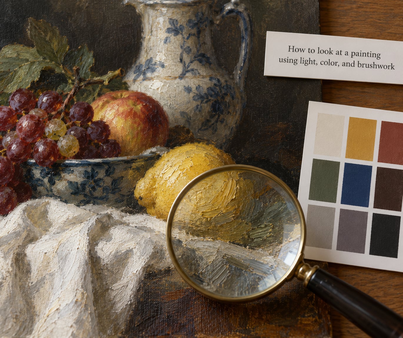
Start with light. Where does it come from inside the picture, how many directions does it come from, and what does it leave in shadow? A single source that rakes across a face tells you one kind of story. Even, sourceless light tells you another.
Then look at value, which is how light or dark a color is, not which color it is. Squint at the picture until the detail blurs and you can see its light-and-dark skeleton. That skeleton carries the forms, and many painters build it first.
Warm colors tend to come forward, cool colors tend to recede, and that single fact explains most of the depth in any picture. In Hokusai’s The Great Wave off Kanagawa, the blue-green crest pushes toward you while Mount Fuji sits pale and blue-grey and far away, tiny and unmoved under a sky that is barely different from the sea.
Watch saturation, meaning how pure and intense a color is. Used everywhere it disappears; used in one small spot it pulls the eye there like a magnet. A single red sleeve in an otherwise blue-grey painting is doing exactly this.
Edges tell you what you are allowed to know. Crisp edges say look here and be certain. Lost, dissolving edges say the shape continues into the next one, and they are how painters make fog, smoke and soft fabric.
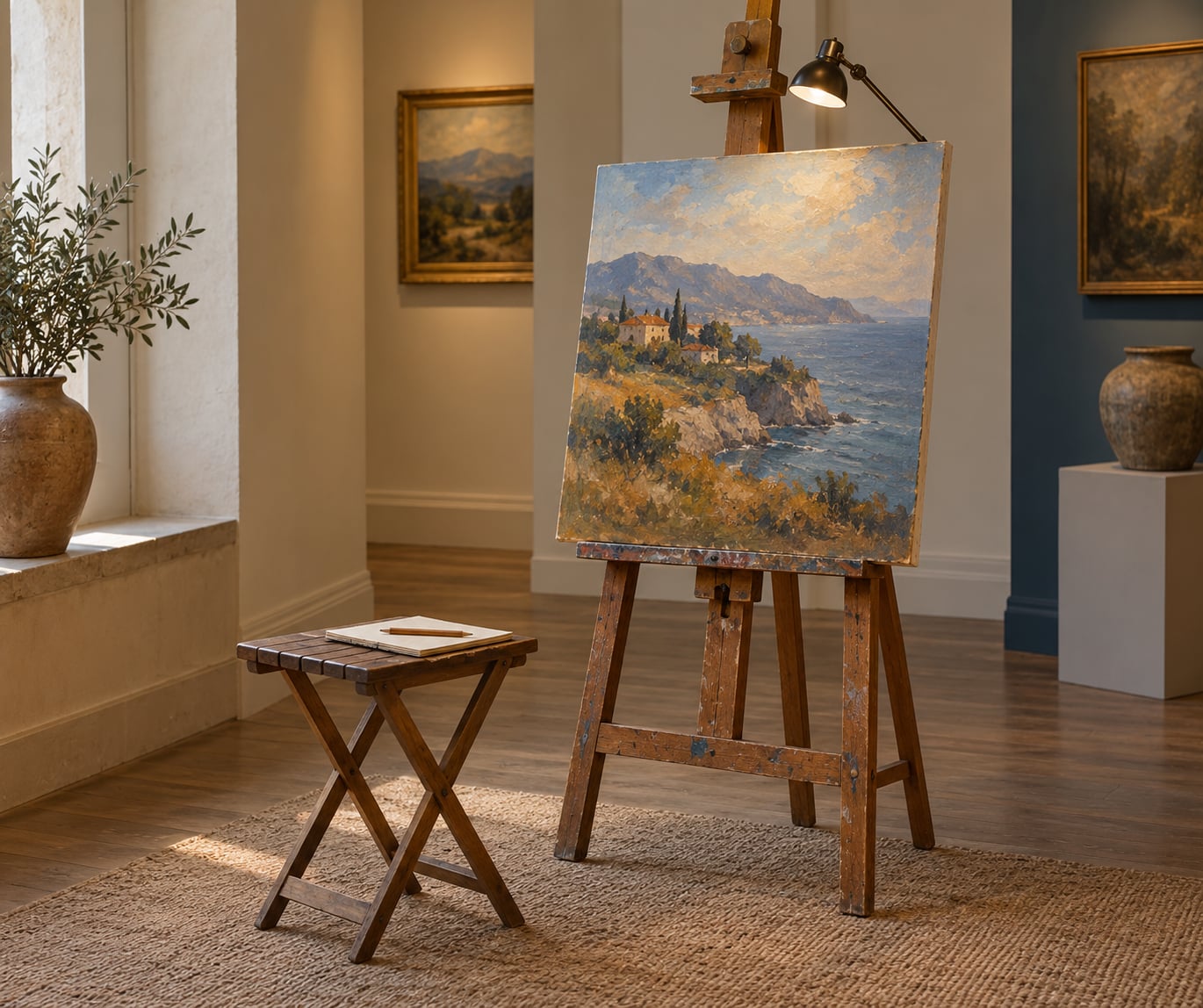
Finally, get close enough to see the paint. Thick paint that holds real ridges and catches gallery light is called impasto. Thin transparent layers built up one over another are glazing, and they produce depth of color no single thick stroke can. Van Gogh’s The Starry Night is built from heavy rolling strokes in the sky with fine hatching packed into the swirl, so the surface moves as you change position in front of it.
Give each of these a moment and you will find you can describe any painting in a sentence. That sentence is usually better than anything a critic writes, because it is grounded in what you actually looked at.
How to look at a painting for mood, story, and meaning
Only now move from what to why. Mood usually comes out of the technical choices you have just described: a cold blue palette with soft edges feels distant, hard side light and heavy contrast feel tense, high viewpoint and lots of sky feel exposed.
For story, look at what has been left out. Cropping is a decision. A figure whose path is cut by the edge of the frame implies something outside the picture, and a room where one chair is turned slightly away suggests someone just left.
On symbols, slow down. A skull, an hourglass, wilting flowers, a mirror, a set of keys: these carry traditional meanings, usually a memento mori, a reminder that time passes and that status and beauty end. But a symbol is a convention, not a fact, and the same object has meant different things in different places and centuries. Describe it first, then check whether the gallery, the catalogue or a reference source supports the meaning before you repeat it to anyone.
Last, separate your response from the artist’s intentions. Saying the painting puts you in a cold, quiet room is an honest observation about your own experience. Saying the artist wanted you to feel alone is a claim about somebody else’s mind that you cannot verify. The first is real. The second might be wrong, and it does not need to be true for the painting to matter to you.
How to look at a painting in a museum or gallery
Stand with your back to a wall and give yourself one work at a time. The pressure to keep moving and see a lot is the single biggest reason people leave a museum remembering nothing, and no gallery is improved by you having seen everything in it.
Sit if there is a bench. Museums that provide seating report longer looking, which tells you about as much as you need to know about how attention works.
Now read the label, and then look again. The second look is where labels pay off, because a name, a date or a line about the medium gives you specific things to go and check. If the label mentions a figure in the background, or a change the artist made to the composition, look for those. Paintings get revised, and finding the revision is a real thrill.
Check the medium and dimensions on the label, since they predict how the surface will behave. Oil on canvas takes a small brush differently from fresco or tempera, and a huge canvas asks for a different viewing distance than a panel the size of a notebook.
Reproduction is not a consolation prize here. A good printed copy beside the original, or a large reproduction in a gallery book, is a legitimate way to compare a detail you could not reach in the room.
| Where you stand | What becomes visible |
|---|---|
| An arm’s length | Edges, brushwork, small objects, the texture of the paint |
| Two to three metres | The focal point, faces, and how light is distributed |
| Across the room | Balance, overall value, the pattern of the whole composition |
| Slightly off to one side | Relief and modelling, because you stop seeing the picture as a flat rectangle |
On etiquette, briefly, since it affects everyone else: no flash, phone on silent, voices low, do not lean or rest anything on the wall, and step aside when someone wants a photograph. If you are with someone, agree to discuss it outside the room rather than narrating over strangers.
If nothing happens, let it be flat. Feeling nothing is a normal response to a lot of very good painting, and plenty of people who love pictures describe the moment of getting one as a switch that flipped on a second or third visit rather than the first. Come back to it later.
The Seven Elements of Art, in Plain English
Artists describe what they do with seven basic elements. You do not need to check all seven every time, and most pictures are loudest about two or three of them. Use this table as a quick reference and hunt for the elements the work is actually about.
| Element | What to look for | A painting that shows it clearly |
|---|---|---|
| Line | The marks that make edges, contours and hatching | Gustave Caillebotte’s Paris Street; Rainy Day, built from long diagonals |
| Shape | Flat two-dimensional areas, geometric or organic | The broken planes in Picasso’s cubist portraits |
| Form | Objects that read as solid, weighty and rounded | The volume of the jug and the poured milk in Vermeer’s The Milkmaid |
| Color | Hue, and how warm and cool colors sit beside each other | Hokusai’s The Great Wave off Kanagawa |
| Value | The light-and-dark structure; what you see when you squint | Rembrandt’s self-portraits, light on a face against a dark ground |
| Texture | The surface you can almost feel, painted or merely implied | Van Gogh’s The Starry Night and its ridged paint |
| Space | Overlap, scale change and perspective, the tricks that push a flat wall backwards | Jan van Eyck’s Arnolfini Portrait, with a tiny convex mirror at the back of a deep room |
Two cautions about color. Warm and cool associations are strong but not universal, and color symbolism varies wildly across cultures and centuries, so treat any quick color meaning you read online as a habit of one tradition rather than a fact about the picture.
Common Mistakes
Most bad gallery experiences come from the same handful of habits, and all of them are fixable in a minute.
Rushing to identify the subject. The subject is rarely the point. Name it in one line, then spend your attention on how it is arranged, because the arrangement is where the painting is doing its work.
Hunting for hidden symbolism. The hunt ends the looking. Describe the object, note what it repeats, and treat any meaning as a question to check later rather than a find.
Treating your reaction as wrong. Boredom is information. It usually means the entry point was wrong, not that your taste is broken, so go back to structure rather than to the label.
Reading only the label. A label is a summary written by someone else. Look for five minutes first, then read, then look again, and the label becomes a second opinion instead of a substitute for attention.
Borrowing expert language. Say what you see before you reach for a term. Bright white against dark green is more useful to you than a word you have not defined, and using a word you cannot unpack is how people end up feeling they are faking it.
Treating the first impression as the verdict. Write it down, keep it, and come back. Plenty of people have dismissed a painting and then found it years later in a book, wondering what they had missed.
Staying at one distance. Alternating close and far is the cheapest exercise in art appreciation available, and it is the one most people skip.
The habits that work are unglamorous. Write things down in specific words. Take the work seriously enough to give it real time. Stay curious about what the artist did before worrying about what it means. And remember that looking with someone else is more fun than looking alone, so save your observations for the café afterwards.
Frequently Asked Questions
What should I look at first in a painting?
Start with the whole work for about three seconds, before any detail: its size, its format, where the light sits, and where your eye jumps. Then write three or five words for your honest first impression before you read anything else. That unfiltered note is your baseline, and every observation after it is measured against it.
Do I need to know about the artist to understand a painting?
No. Background helps, but it can also crowd out your own looking, because you end up testing the work against what you read instead of what you see. Look first, read the label second, then let the artist, the date and the movement change what you notice on a second pass. Curiosity about context is a better teacher than storing context in advance.
How can I tell what a painting is about without guessing?
You cannot read the topic off the canvas, but you can describe what the picture is doing: where the light falls, who is looking at what, what has been cropped away, which objects repeat. From that description a subject often suggests itself. Frame it as a possibility, and check it against the gallery label or a catalogue before you repeat it to anyone as fact.
Why do I feel nothing when I look at abstract art?
It is common, and it usually means the entry point was wrong rather than that your taste is broken. Abstract work rarely announces its subject, so begin with structure: how the shapes group, where the contrast is, what the eye jumps between, where the empty space sits. Many people describe an emotional response only after a second visit, once the composition has settled into place.
Should I use the museum label while looking at the artwork?
Look first, read second, look again. Labels give you the title, date, medium and room context, which is genuinely useful, but reading one beforehand puts someone else’s words in your mouth. If a label mentions something you did not notice, go back and find it. Tracking down what the text points at is the most useful thing a label can do for you.
How long should you look at a painting in a museum?
Long enough to see the whole work once, examine one thing closely, and write two sentences. That is usually three to five minutes on a first visit and ten or more on a return. Attention research in museums keeps finding that visitors spend only seconds on most works, so a short deliberate visit is worth far more than a long unfocused one.
Start With One Detail
Here is the exercise. Pick one painting, the one nearest to where you are right now, and give it ten minutes of the full method. Start with whatever commanded your attention in the first second, whatever it was, a colour, a shape, a face, nothing much. Follow it through the composition, then through the light, then through the surface, then ask what it all adds up to.
Write down what changed after each pass, because the notes are the point. Most people find that the painting they gave eight seconds to becomes a different object by minute six, and that the detail which seemed minor turns out to be holding the whole composition together.
Then do it again the next time you walk past the same room. Nothing in art rewards a second visit more generously than a painting you have already looked at properly once.